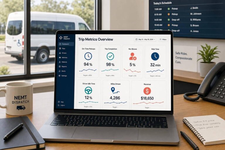
If I had to boil this down to one point, it’s this: a small set of trip metrics can show where an NEMT fleet is losing trips, time, and money. In this article, I focus on 7 numbers that matter most: on-time pickup rate, trip completion rate, no-show rate, ride time, driver idle time, miles per trip, and revenue per trip.
Here’s the short version:
- Service shows up first in on-time pickups, trip completion, and no-shows
- Time use shows up in ride time and driver idle time
- Cost control shows up in miles per trip
- Cash collected shows up in revenue per trip
The article also makes a simple point: tracking the metric is not enough. You need to:
- split data into the right groups
- compare scheduled times with actual GPS times
- check broker-facing metrics every week
- match completed trips to claims before billing deadlines
A few numbers stand out right away:
- About 3.6 million Americans miss or delay care each year due to transportation barriers
- Many broker contracts look for about 95%+ on-time pickup
- Below 90% on on-time pickup or trip completion is a warning sign
- Driver idle time above 10% needs attention, and 25%+ points to wasted paid hours
- Deadhead miles above 40% call for review
- Automated reminders can cut no-shows by up to 57%
If I were reading this article to decide what to watch first, I’d focus on these questions:
- Are pickups happening on time?
- Are scheduled trips getting completed?
- Are no-shows coming from riders or from the fleet?
- Are patients spending too long in the vehicle?
- Are drivers being paid while sitting between trips?
- Are too many miles being driven empty?
- Is collected revenue per trip keeping up with cost?
That’s the core idea of the full piece: use a short list of trip-level metrics to spot service gaps, dispatch issues, billing misses, and route waste before they turn into broker problems or lost income.
Quick Comparison
| Metric | What it tells me | Common warning sign |
|---|---|---|
| On-Time Pickup Rate | Whether vehicles arrive within the pickup window | Below 90% |
| Trip Completion Rate | How many scheduled trips were finished | Below 90% |
| No-Show Rate | How many trips failed at pickup | High rider or provider no-shows |
| Ride Time | How long the passenger stayed in the vehicle | Trips running longer than planned |
| Driver Idle Time | Paid time not tied to revenue trips | Above 10% |
| Miles Per Trip | Distance and route cost per completed trip | Deadhead ratio above 40% |
| Revenue Per Trip | Cash collected for each completed ride | Low collections or claim denials |
So if you want the plain-English takeaway, it’s this: these seven metrics give a fleet owner or manager a direct read on service, labor use, route waste, and billing results without needing a huge dashboard.
sbb-itb-af83355
What Makes a Trip Metric Worth Tracking
Not every trip number deserves a spot on the weekly dashboard. These seven do, because each one ties straight to a decision about service, efficiency, compliance, or profit. A metric should earn its place. If it doesn’t change how you dispatch, bill, or staff, it probably doesn’t belong in weekly tracking.
These seven metrics matter because they shape four core areas:
- Service reliability – Does the fleet hit promised pickup and drop-off times?
- Efficiency – Is the fleet using driver time, fuel, and vehicle capacity well?
- Compliance risk – Does trip data point to denial, documentation, or audit trouble?
- Financial impact – Does each trip cover its operating cost and leave enough margin?
Use those four lenses to judge every metric below. For each one, look at what it means, how to calculate it, what poor performance tends to signal, and how software brings the issue into view. Modern platforms offer integrated analytics and GPS tracking to automate this oversight. Connected dashboards can flag exceptions without the inefficiencies of manual dispatch. The sections below follow the same lens, which makes side-by-side comparison much easier.
Start with the metric that shows fastest whether service is on track: on-time pickup rate.
1. On-Time Pickup Rate
On-time pickup rate (OTP) shows the share of trips where the driver gets there within the scheduled pickup window. It helps to track outbound and return trips on their own. Will-call returns often lag, and if you mix them into one average, the problem can slip past you. That’s why OTP is often the clearest early warning sign for dispatch issues.
On-Time Pickup Rate (%) = (Trips picked up on time ÷ Total trips) × 100
Many broker contracts aim for 95% or higher. If you drop below 90%, that’s an urgent sign to dig in and review what’s going wrong.
Brokers use OTP to score providers and decide who gets more trip volume. In plain terms, if your pickup times slide, your standing can slide with them. Common causes include late confirmations, poor vehicle assignment, and weak pre-positioning.
Cloud-based NEMT software platforms can log actual arrival times against scheduled windows by using GPS timestamps. And automated alerts for performance below 90% give dispatchers a chance to step in that same day instead of finding out later.
If pickup timing starts to slip, the next metric often shows whether the trip got completed at all.
2. Trip Completion Rate
Trip completion rate shows what portion of scheduled trips were actually completed. And that matters because every trip that falls through – whether it’s a no-show, a rider cancellation, or a provider cancellation – hits your bottom line.
Trip Completion Rate (%) = (Completed Trips ÷ Total Scheduled Trips) × 100
Healthy fleets often land around 92% to 96%. If you slip below 90%, brokers like Modivcare and MTM start paying attention. If that low rate keeps showing up, it can lead to a contract review.
The headline number helps, but it doesn’t tell the whole story. Why did the trip fail? That’s where the useful detail lives.
Instead of leaning on one blended rate, split completion losses into clear groups:
- Rider no-show
- Rider cancellation
- Facility cancellation
- Provider cancellation
That way, the fix fits the problem. A rider no-show calls for one response. A provider cancellation points to something else entirely.
Trip completion rate tells you how many scheduled trips made it to the finish line and where your operation is starting to crack. Dispatch software tracks trip status in real time, which gives managers a chance to step in early. They can shift staffing, confirm issues with problem facilities, or move coverage away from weak time slots before broker reviews become a problem.
Once those completion patterns are clear, the next metric helps isolate losses tied to rider behavior instead of system performance.
3. No-Show Rate
No-show rate tracks trips that fall apart because the rider or the vehicle never completes pickup. You should track rider-side and provider-side no-shows on separate lines, because they don’t affect your team the same way.
No-Show Rate (%) = (No-Show Trips ÷ Total Scheduled Trips) × 100
A patient no-show is outside your control. A provider no-show means the vehicle never shows up, or it gets there too late to finish the trip. That split matters. If you can’t show where the failure started, it’s hard to fix the right problem.
Dispatch software helps on both fronts. GPS timestamps can confirm when a driver arrived, while automated reminders can cut rider no-shows before a vehicle is sent out. NEMT Cloud Dispatch also includes notification tools that support those confirmation steps with less manual effort.
Review no-show data every week across a few angles:
- rider
- facility
- driver
- route
That makes it easier to separate member patterns from issues inside your own operation. Once you know why trips are failing, the next metric looks at what happens to the rides that do get underway.
4. Ride Time
Ride time is the total time a passenger spends in the vehicle, measured from pickup to drop-off.
Ride Time = Drop-Off Timestamp − Pickup Timestamp
Use pickup and drop-off timestamps to keep ride time audit-ready. Those same timestamps help build a clean record for Medicaid billing and broker reviews.
This metric matters for a simple reason: long ride times can wear patients out and delay care for time-sensitive riders. Longer trips also add labor and fuel costs. And brokers like Modivcare and MTM compare actual ride durations against promised windows, so repeated misses can hurt contract performance.
It also helps to separate dwell time from ride time. Dwell time is the gap between arrival and trip start. That split makes it much easier to tell whether the problem happened on the road or before the trip even began.
Reporting software flags trips that run past their planned duration or drift off schedule. When ride times keep coming in above estimates, that often points to weak routing, bad traffic assumptions, or too little buffer time. If the delay starts before the wheels are moving, driver idle time helps show where the gap begins.
5. Driver Idle Time
Ride time tells you how long patients spend in the vehicle. Driver idle time tells you where payroll slips away before trips start or in the gaps between them.
Driver idle time is the share of paid hours when a driver is logged in but not handling a revenue trip.
Driver Idle Time = Paid Hours − Revenue-Generating Hours
Revenue-generating hours include active trips and required repositioning. What remains is idle time: paid capacity that isn’t producing trips and still adds cost.
A good target is to keep idle time below 10% of total working hours. Once it hits 25% or more, that’s a warning sign. And the impact can be pretty direct: cutting driver idle time from 25% to 12% can lift completed trips per driver by 15%.
When idle time runs high, the cause is often pretty plain:
- Scheduling gaps
- Too many drivers on shift
- Shift timing that doesn’t match demand peaks, such as early-morning dialysis runs
GPS-based reporting in NEMT Cloud Dispatch can split active hours from idle hours and flag drivers who go past the 10% mark. That kind of visibility makes it easier to trim dead time and rebalance shifts before the issue grows.
Review idle time every month so staffing stays in line with trip volume. If the number stays high, it usually points to another issue worth checking next: whether those miles are being used well.
6. Miles Per Trip
If idle time is high, the next step is to look at whether those miles are doing useful work. Miles per trip tells you how far your fleet has to drive to finish a ride. More miles usually mean more fuel, more labor, and more wear on the vehicle, making it essential to cut NEMT operating costs wherever possible. So this isn’t just a distance metric. It’s also a cost and dispatch metric.
Average Miles Per Trip = Total Miles Driven ÷ Total Completed Trips
You should also track your deadhead mile ratio (empty miles ÷ total miles) to see how much distance brings in no revenue. Below 30% is strong. Above 40% needs review.
When miles per trip keep going up without a matching lift in revenue, that often points to weak trip clustering, poor shift design, or the wrong vehicle assignment. Route optimization can cut deadhead miles by up to 30% and fuel costs by 15% to 25%.
GPS route tracking helps separate loaded miles from empty miles and shows how actual routes compare with planned ones. That makes it easier for managers to catch waste early, before mileage gets out of hand. If mileage starts climbing faster than revenue, the next metric to look at is revenue per trip.
7. Revenue Per Trip
Mileage shows how far your fleet is going. Revenue per trip shows whether those trips are bringing in cash. This metric looks at collected revenue for each completed trip, not billed charges. That matters because billed amounts can look fine on paper while money never shows up in the bank.
Revenue Per Trip = Total Collected Revenue ÷ Total Completed Trips
If this number is low, denial rates are often part of the problem. In many cases, that points to documentation gaps, billing mistakes, or a payer mix that pays less. Revenue per trip is a blended average across payers and trip types, so lower-rate ambulatory broker trips can push volume up while pulling the average down.
Billing-integrated software connects completed trips, claims, and collections in one place. That helps staff spot denials and missing claims sooner instead of finding them weeks later.
To get a clearer read, track this metric by:
- Vehicle type
- Payer
- Contract
It also helps to reconcile completed trips against submitted claims every week. That’s one of the simplest ways to catch unbilled rides before filing deadlines pass. Use the quick reference below to compare this metric with the others.
Quick Reference: Benchmarks and Formulas for All 7 Metrics
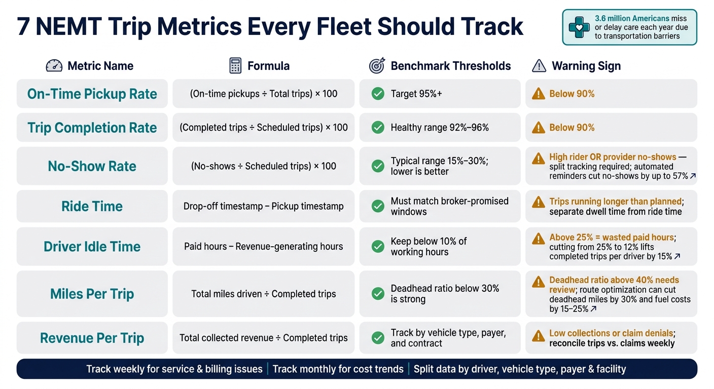
7 NEMT Trip Metrics: Benchmarks, Formulas & Warning Signs
Use this table as a fast reference for dispatch, billing, and owner review. Each metric ties back to a different day-to-day call: dispatch, staffing, routing, or billing. The goal is simple: spot the metric that needs attention first, then act on it.
| Metric | Formula | What it shows | Likely causes | First fix |
|---|---|---|---|---|
| On-Time Pickup Rate | (On-time pickups ÷ Total trips) × 100 | Low: Below 90%. High: 95%+ | Traffic, poor buffer times, driver tardiness | Add buffer time at shift starts and review recurring delay routes |
| Trip Completion Rate | (Completed trips ÷ Scheduled trips) × 100 | Low: Below 90%. High: 92%–96% shows stable operations. | Vehicle breakdowns, last-minute driver cancellations | Audit fleet maintenance logs and review routes or drivers with repeat cancellations |
| No-Show Rate | (No-shows ÷ Scheduled trips) × 100 | Typical no-show rates run 15% to 30%; lower is better. | No reminder system in place | Automate SMS, email, or voice reminders the night before pickup |
| Ride Time | Drop-off time − Pickup time (per trip) | High: Delays on route. Low: Efficient routing and driver adherence. | Construction, traffic, poor stop order | Review dwell times at specific facilities and coach on route adherence |
| Driver Idle Time | Paid hours − Revenue-generating hours | High: Above 10% of working hours points to scheduling gaps and unnecessary labor cost. Low: Higher fleet utilization. | Over-hiring, schedule gaps, poor zone assignment | Reassign idle drivers to high-demand zones during known slow periods |
| Miles Per Trip | Total miles driven ÷ Completed trips | High: Empty miles eroding margin. Low: Dense dispatching. | Reactive dispatching, no multi-stop routing | Use proximity-based dispatching and return-trip pairing |
| Revenue Per Trip | Total collected revenue ÷ Completed trips | Low: Poor payer mix or billing errors. High: Stronger payer mix. | Billing modifier errors, low-rate broker volume | Audit revenue by payer and review low-rate contracts |
Broker thresholds vary by contract, so compare each number against your own fleet before you stack it up against published targets. That matters because a rate that looks weak on paper may be normal for your payer mix, service area, or trip type.
Reporting software helps turn these benchmarks into alerts, trend lines, and trip-level exceptions. Instead of digging through rows of data, you can see where the problem starts and which fix should come first.
How Reporting Software Turns Trip Data Into Decisions
Tracking the seven metrics above only matters if the data leads to action. The point isn’t the raw trip count. The point is what the software helps your team do with it.
GPS timestamps create a clear record of arrival and departure. That gives teams something they can check later if there’s a dispute. Live GPS tracking also helps dispatchers catch delays as they happen and reassign trips before a late driver turns into a missed pickup.
Historical GPS data helps in a different way. It can show repeat bottlenecks, long wait zones, or pickup windows that were too tight from the start. That gives fleets a better shot at fixing future schedules instead of repeating the same problem every week.
Automated no-show classification saves a lot of manual review. It separates a patient no-show from a provider no-show in one step, so managers can send the issue to the right place, whether that means reminders or dispatch. And that matters, because automated reminders have been shown to reduce no-show rates by as much as 57%.
Once trip status is clean, that same data should move straight into billing. Reporting software matches completed trips against submitted claims and flags unbilled rides before the billing window closes. Several platforms – including NEMT Cloud Dispatch and NEMT scheduling tools such as RouteGenie – connect GPS trip data right into billing workflows, so dispatch records and claims stay in sync.
Driver productivity dashboards show active hours versus idle hours and call out exceptions. Route efficiency reports measure deadhead miles as a share of total miles, which makes it easier to see where fuel and driver time are being used without bringing in revenue.
These reports do their best work when they shape the next dispatch call, billing follow-up, or staffing move.
Conclusion
You don’t need a 40-metric dashboard to run a tighter NEMT operation. These seven metrics give you a clear view of what matters: on-time pickup rate, trip completion rate, no-show rate, ride time, driver idle time, miles per trip, and revenue per trip.
Taken together, they show how you’re doing on service quality, driver use, and financial health. The key is reviewing them on a set schedule, not just when something goes wrong.
Review them weekly to catch service and billing issues. Review them monthly to spot cost trends.
It also helps to break the numbers out by driver, vehicle type, payer, and facility. That makes it much easier to spot repeat delays, denials, and underuse before they turn into broker-facing problems.
These metrics now affect trip volume, renewals, and broker scorecards.
Reporting software helps make this process stick. It pulls dispatch, GPS, and billing data into one place, so teams spend less time sorting through spreadsheets and more time acting on the numbers. The goal is simple: faster dispatch, cleaner billing, and earlier fixes.
FAQs
Which of these seven metrics should I track first?
Start with on-time pickup rate. It’s the main metric brokers score, and it usually comes down to dispatch performance, like late confirmations or poor pre-positioning.
Then pair it with trip completion rate right away. That shows how often scheduled rides actually happen.
Put those two side by side, and you get a clear read on trust and contract continuity. They also make weak spots easier to find, especially when you’re using GPS-timestamped reporting.
How often should I review NEMT trip metrics?
Review trip metrics on a tiered schedule so small issues don’t turn into bigger ones.
- Weekly: on-time pickups, cancellations, no-shows, denials, and unbilled trips
- Monthly: vehicle utilization and cost per trip
- Quarterly: contract profitability and overall fleet strategy
That cadence gives managers a simple rhythm. Weekly reviews help catch service issues fast. Monthly check-ins show how well vehicles are being used and what each trip is costing. Quarterly reviews zoom out and look at the bigger picture, including contract profit and fleet direction.
Cloud-based NEMT software can also help by tracking KPIs in real time. That means managers can make day-to-day changes as things happen instead of waiting for end-of-day reports.
What data do I need to calculate these metrics accurately?
You’ll need trip-level timestamps and status history, plus rider and trip outcome IDs, mileage data, driver/vehicle assignments, shift-time records, and trip-level financial fields.
That means pulling in details like:
- Scheduled vs. actual pickup and drop-off times
- Completed vs. canceled/no-show status
- GPS or odometer miles
- Idle-time records
- Authorized cost, reimbursement, paid amount, and operating cost inputs
Reporting tools use this data to spot weak points fast.